Sportswear Site →
UX / UI / TESTING
Product listing pages optimisation
Optimisation is where most UX teams spend most of their time, either spurred on by new industry trends, declining performance KPI’s or just desire to get better performance out of certain pages or sites. In this brief case study we will apply some lean UX principles to quickly design, test, iterate and deliver better design.
THE CHALLENGE
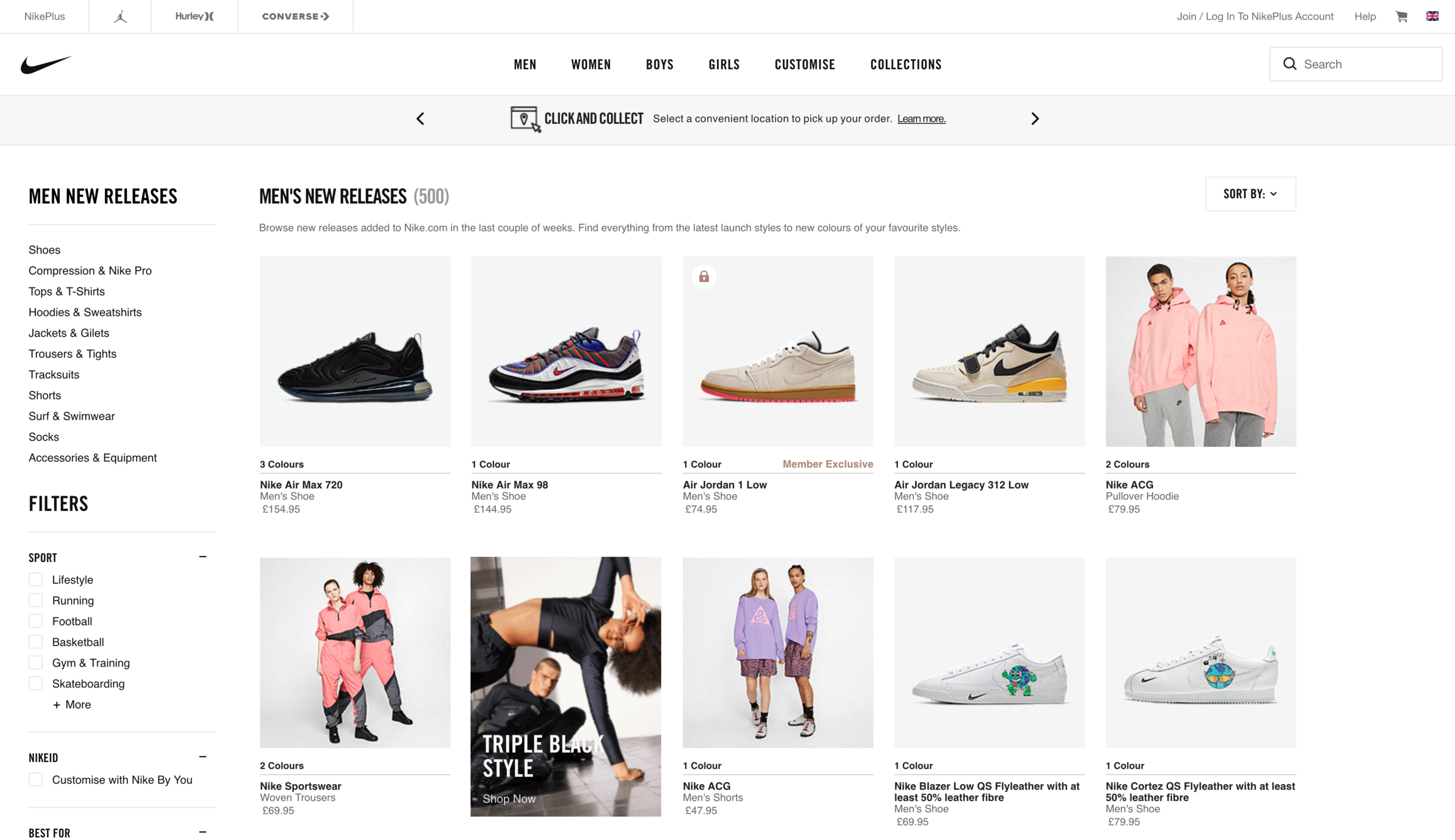
Nike product listing pages ( from now on PLP’s ) have some issues at the time of delivering this project. It’s important to note that these are just my starting point for improvements based on some e-com best practices, my experience and some information made available to me.
Duplication
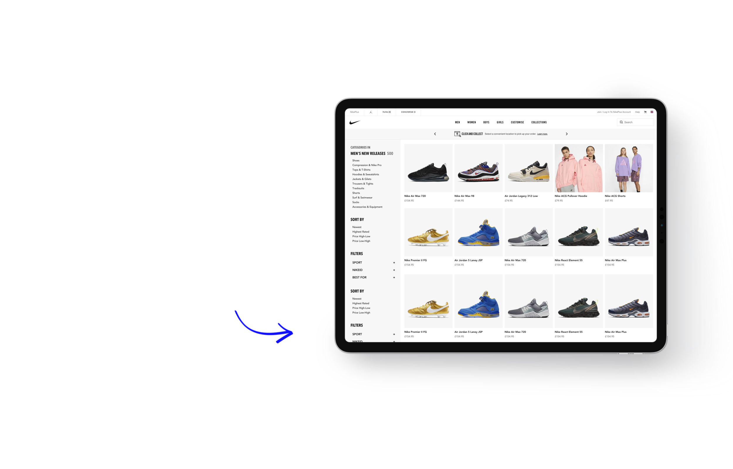
Men’s new releases category title is duplicated all across PLP and sub-categories of particular section are in the product cards
Sizing
From product cards not slightly fitting in to some of the font sizes being quite small - some of the most popular desktop screen resolutions deliver underwhelming usability standards
Layout
For discovery led journey products seems to be not as ‘in-focus’ as I’d expect them to be and filters/categories merge with rest of the page
THE APPROACH
Using Sketch we put together quick alternative page layout, we moved some elements around and hid filtering and sorting behind a button whilst giving more focus to ‘next step’ categories by putting them in sub-header nav. It’s clear that this version is quite ‘out-there’ but it’s important to start with the most radical changes so that when we come to test this we gain valuable insight on what works on what doesn’t.
If we were to make an extremely similar design with minor changes we wouldn’t learn as much as we did about our design and what’s currently live on site.
For our rapid testing platform we will use Usabilityhub ‘Preference test’ where you pit two designs side by side and ask testing panel to pick one and you get the chance to ask follow-up questions. Reason for choosing this is that we want to gain as much insight as fast as we can so we can start moving in the right direction.
FIRST TEST
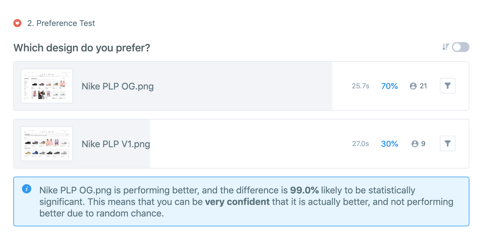
So how did we do? Well, about as well as expected ( Rome wasn’t build in a day! ) but we learned a ton, which is exactly what we were trying to do. So, let’s look at the outcome below
OG stands for ‘Original’ and V1 is our first design iteration. Important to note that we targeted this at typical Nike persona - UK located, Full, part of self employed ( or student ) in age gap of 18-35.
FEEDBACK ANALYSIS
Without going in too much detail the biggest feedback item by far was that sidebar filters and navigation are perceived to be important and people like them followed by how other design ( our V1 design ) looked clearer, images are better and there’s more product focus. No-one mentioned the new card design in negative way which was surprising so we’ve decided to keep in in V2 of design.
Feedback word cloud
ACTION PLAN
So now that we have these insights we went on to incorporate them in our V2 of design.
Sidebar navigation and filters return with sorting options is same section
We’ve added darker background colour to sidebar
We made cards about 11% bigger
We brought back the sub-header promo content slot ( Click&Collect )
We merged page title and filter title with the ‘Items displayed’ as well
Filters are collapsed by default giving more prominence to sub-category navigation
RINSE AND REPEAT
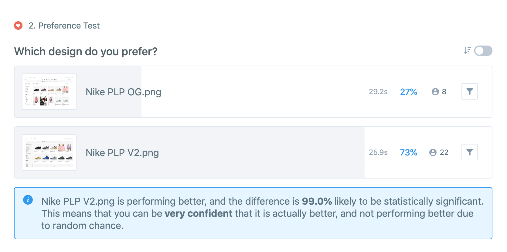
Time to test again! We’re confident that this design is addressing most of the feedback that we’ve got back and it’s still considerable improvement over the Original design live on site so we decided to test this against original design rather than our V1 design as the ultimate goal is to deliver design that’s better than what’s on the live site.
RESULT
Our version 2 of the design considerably beat the original ( live ) Nike PLP design! It’s great news as it only took us two rounds and few hours to get to something that’s better than on live. It’s important to note that this design can and should be improved further by running in-depth Usability session and it’s only a starting point as the nature of these tests are based on flat perception of one design vs the other.
For this particular design testing next step I would recommend running on-site A/B test with our version 2 and Original design as the changes would not be particularly hard to develop and A/B test would give a lot more detailed insight around commercial and interaction performance.
Let’s have a look at why people chose our V2 design
