betting Site →
UX / UI / RESEARCH
Online Gambling Redesign
Based on personas document and some quick competitor research I've designed high fidelity restructure and UI for the Online Roulette site. Some of the design decisions and why I've made them below. Obviously they would require further validation and research but for purposes of this I believe it's good progress based on information available.
Initial wireframe was changed to cater and condense some areas into more user centred design layout.
Instead of having two different sections of 'Best of' and 'Free games' both have been combined into single component view with toggle to trigger Free vs Paid. Most polarising points of importance seem to be Free vs Paid, Payout speed and deposit methods and this addresses first point without compromising on experience for either ( Free play personas don't have to scroll and hope that free play is on this page )
There seems to be a lot of what I can only assume is SEO keyword focused copy littered all around the page, my suggestion is to move that further down the page and some of the FAQ content to be set in accordion to not obstruct what I believe is the primary goal for this page - play discovery and conversion. There's important point to note that with recent Google algorithm changes SEO keywords are getting less traction and Google is starting to pay really close attention to how people engage with content and ranking sites based off that, so, accordion would make it more obvious to Google if people are engaged with content which in turn should help rankings.
With 'Bonuses' quite high on all three personas priorities I've added bonus area for individual Play card. Reviews and Payout info has also gained prominence, with stronger CTA added. Filtering and sorting of deals has been also added and there is example screen of how I imagine filter would work.
New Top banner area has replaced copy paragraph and in my example it could promote hand holding aspect of finding games which could be built on top of existing filter functionality to provide games discovery journey that could lead to higher engagement and better conversion due to more relevant results shown and 'in-control' aspect of the feature. My assumption here is that personalisation would not be possible due to low return rates to these type of pages.
There are some other small tweaks ( Load more after certain amount of results to allow to get to footer, CTA and info size etc. ) mainly to cater for mobile usability and Goggle best practises as I imagine SEO placement in SERPs to be quite important for this kind of landing page.
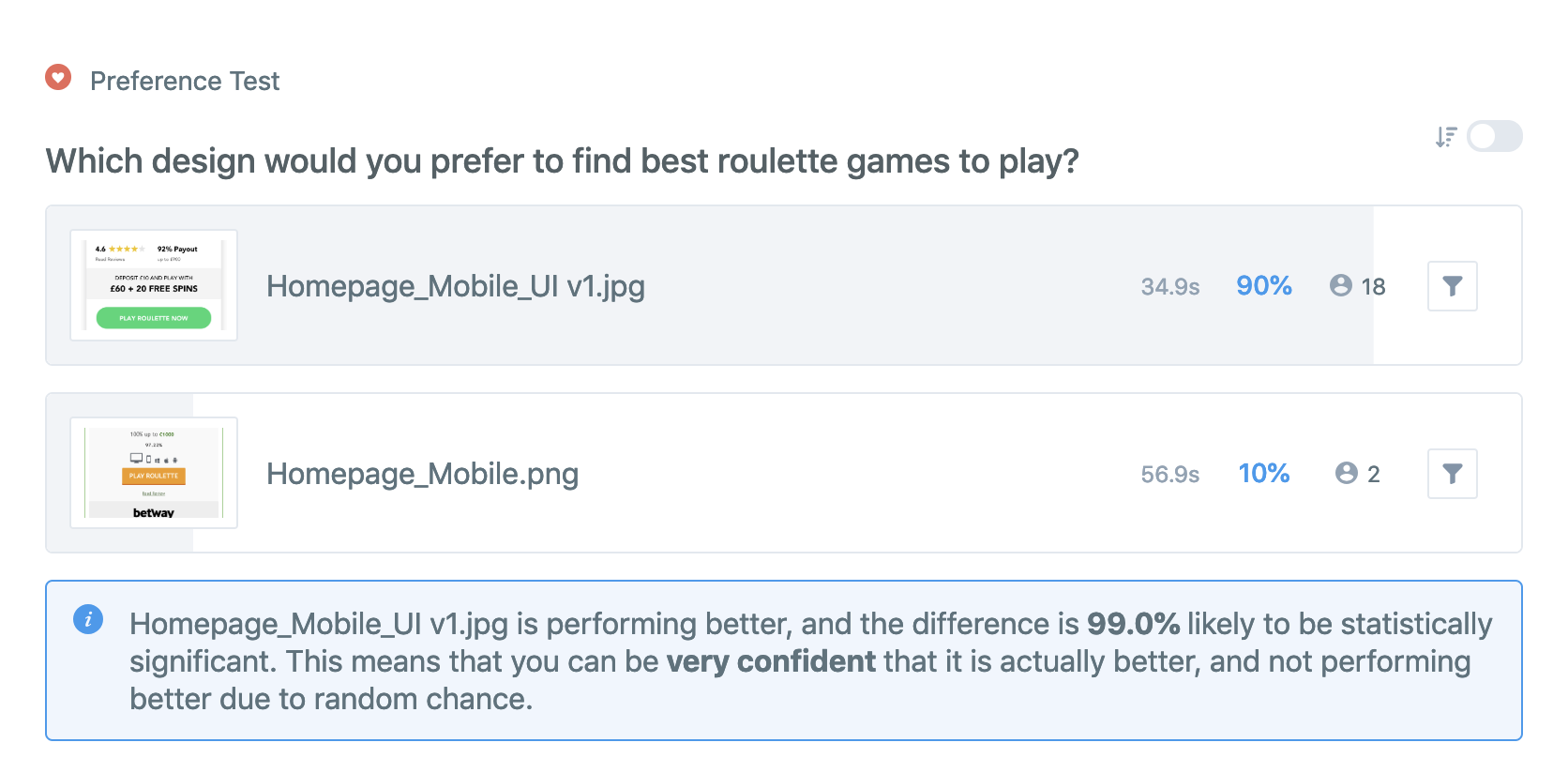
Further to this I've decided to write up a short Qual test and test with 20 people my proposed design versus existing one to gather some feedback for further improvements.


Please see link to results below
https://app.usabilityhub.com/tests/a0995b7455ca/results/6de110269e01
My design was chosen 90% of the time but there are some further areas for improvement.
Having original branding in the new design header and re-working / adding some iconography, perhaps adding some info buttons on each play card containing more info in overlay could be next avenues to explore for improvement on my design.


